My Role
My Role
• UX Researcher
• Product Designer
timeline
80 Hours
80 Hours
Project overview
Project overview
This project represents my culminating assignment during my enrollment at UX Academy. I was assigned the responsibility of conceiving a comprehensive end-to-end design, including the development of a minimum viable product.
The primary objective of this undertaking was to prepare a proof of concept suitable for presentation, with the added requirement of ensuring full functionality for at least one key feature.
tools used
Figma

Problem Statement
Problem Statement
Couples planning to get married need a way to visualize and craft their wedding day schedule to ensure it fits within their time constraints and accommodates all of the activities they want to include.
One major insight that emerged from the interviews was the challenges that came with building a wedding day schedule. While there are plenty of tools to help couples decide the look and feel of the event, there seems to be a gap in the market when it comes to helping couples make sure their vision fits within a set time frame.
One major insight that emerged from the interviews was the challenges that came with building a wedding day schedule. While there are plenty of tools to help couples decide the look and feel of the event, there seems to be a gap in the market when it comes to helping couples make sure their vision fits within a set time frame.
user quotes
"I enjoyed the whole process from finding the right venue to hand selecting each detail for the ceremony. I faced difficulties when it came to budgeting and finalizing the wedding day schedule."
"I had a hard time figuring out the schedule for the day of and I asked around to see if I can use their schedule to build off of."
"It would have been helpful to have access to templates for a multitude of things so that it would make it easier for me to make decisions."
"I try to use tools that allow collaboration from multiple people so that I can accomplish tasks quicker."
assumptions
1. People are overly stressed during the process.
2. People would want an app or online solution that would walk them through every step of the way.
3. People would be motivated to find a tool that would help them stay organized.
My focus was on gaining a deep comprehension of the user needs and pain points within the context of wedding planning. To achieve this, I conducted user interviews to uncover valuable insights into the wedding planning process and to identify common challenges that couples face.
Having been through the process myself, I had general assumptions about the common pain points users would have. Through the interviews I was able to validate if any of my assumptions were correct.
UNDERSTAND
UNDERSTAND
UNDERSTAND
define
define
Emily Carson
Demographics:
Age: 28
Gender: Female
Occupation: Project Manager
Education: Bachelor's degree in Business Administration
Relationship Status: Engaged
Background: Emily is a detail-oriented and highly organized bride-to-be. She enjoys planning and managing projects, and her wedding is no exception. She wants everything to run smoothly and be executed flawlessly. She is tech-savvy and relies on digital tools to streamline her tasks and stay on top of deadlines.

GOALS:
• Find inspiration and ideas for her wedding theme and decor
• Create and manage a comprehensive wedding budget
• Keep track of tasks, appointments, and deadlines
GOALS:
• Find inspiration and ideas for her wedding theme and decor
• Create and manage a comprehensive wedding budget
• Keep track of tasks, appointments, and deadlines
PAIN POINTS:
• Difficulty in managing multiple aspects of the wedding
• Finding trustworthy and reliable vendors within her budget
• Unsure about how to plan the day schedule
PAIN POINTS:
• Difficulty in managing multiple aspects of the wedding
• Finding trustworthy and reliable vendors within her budget
• Unsure about how to plan the day schedule
persona
persona
competitive analysis
competitive analysis

Competitor
Wedding Assistant
WedAssist
Wedding Schedule Maker
Free/Paid
Free
Free
Paid
Paid
Features
Guest List
RSVP
Wedding Website
Wedding Checklist
Budget Calculator
Wedding Itinerary Template
Wedding Vendors
Wedding Day Timeline Template
Ceremony Layout
Seating Chart Maker
Online Photo Album
Table Cards & Place Cards
Reception Menu
Guest List
RSVP
Wedding Website
Wedding Checklist
Budget Calculator
Wedding Itinerary Template
Wedding Vendors
Wedding Day Timeline Template
Ceremony Layout
Seating Chart Maker
Online Photo Album
Table Cards & Place Cards
Reception Menu
Event Questionnaire
Month-to-Month Checklist
Customizable Inspiration Board
Budget Tracker
Timeline Creator
Multiple Timeline Creator
Export to PDF, CSV, Plain Text
Color coordinated categories
Filter by categories
Strengths
Ease of use
Numerous features
Responsive website
Collaboration capability
Numerous features
Ease of use
Export formats
Ease of use
Export formats
Weaknesses
No mobile app
No timeline templates
A bit laggy
No Collaboration
Timeline is visualized as a list
No timeline templates
No Collaboration
Timeline is visualized as a list

Competitor
Competitor
Free/Paid
Free/Paid
Main Features
Features
Features
Strengths
Strengths
Weaknesses
Weaknesses
Wedding Assistant
WedAssist
Wedding Schedule Maker
Free
Free
Paid
Guest List
RSVP
Wedding Website
Wedding Checklist
Budget Calculator
Wedding Itinerary Template
Wedding Vendors
Wedding Day Timeline Template
Ceremony Layout
Seating Chart Maker
Online Photo Album
Table Cards & Place Cards
Reception Menu
Event Questionnaire
Month-to-Month Checklist
Customizable Inspiration Board
Budget Tracker
Timeline Creator
Multiple Timeline Creator
Export to PDF, CSV, Plain Text
Color coordinated categories
Filter by categories
Ease of use
Numerous features
Responsive website
Collaboration capability
Numerous features
Ease of use
Export formats
No mobile app
No timeline templates
A bit laggy
No Collaboration
Timeline is visualized as a list
No timeline templates
No Collaboration
Timeline is visualized as a list
design
design
colors
#223030
#959D900
#F2F3EE
#C0C0C0
#1C1C1C
#B35614
Body Text
Quicksand
Body Text
Body Text
Heading
type
app icon
app icon
app icon
It’s Time
Button
Button
Button
Button
Button
buttons
Placeholder
text field
Placeholder
dropdown
icons
logo
WIREFRAMES
WIREFRAMES
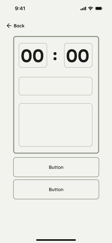
My vision for this app revolved around simplicity and user-friendliness. Given the iterative nature of creating timelines, I aimed for a design that enables quick and straightforward editing and rearranging of elements.
My vision for this app was centered around simplicity, featuring a minimalist design and straightforward functionality. Recognizing the inherent challenge of estimating the duration of each event, the app's primary objective is to facilitate effortless modifications. The emphasis was placed on highlighting key details and ensuring their immediate visibility for user convenience.
My vision for this app was centered around simplicity, featuring a minimalist design and straightforward functionality. Recognizing the inherent challenge of estimating the duration of each event, the app's primary objective is to facilitate effortless modifications. The emphasis was placed on highlighting key details and ensuring their immediate visibility for user convenience.
1st iteration
1st iteration
1st iteration
2nd iteration
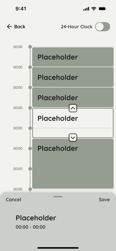
In the second iteration, I made a deliberate choice to refine the UI aesthetics. Drawing inspiration from both Google Calendar and Apple Calendar, I leveraged Jakob's Law to combine elements from these familiar platforms. This approach was intentionally designed to reduce cognitive load by providing a sense of familiarity in the user interface.
In this second iteration, I made a deliberate choice to refine the UI aesthetics. Drawing inspiration from Google Calendar, I found their use of gestures particularly appealing. They skillfully incorporated gestures to reveal event details, creating an effect reminiscent of a card gracefully rising from the bottom.
In this second iteration, I made a deliberate choice to refine the UI aesthetics. Drawing inspiration from Google Calendar, I found their use of gestures particularly appealing. They skillfully incorporated gestures to reveal event details, creating an effect reminiscent of a card gracefully rising from the bottom.
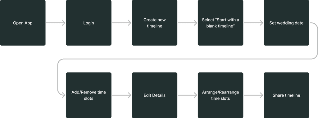
task flow
task flow
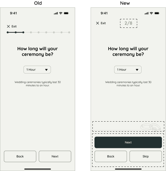
We noticed that the progress indicator on the left seemed a bit cluttered, so we streamlined it to display the number of questions, offering users a clearer understanding of the questionnaire's length. Additionally, we introduced the option to skip a question, providing flexibility for cases when the user may not have an immediate answer. To enhance usability, we also enlarged the 'next' button to make it more distinct from the other two buttons, simplifying its identification for users.
We noticed that the progress indicator on the left side appeared somewhat cluttered. To enhance user comprehension, we simplified it to display the number of questions, offering a clearer understanding of the questionnaire's length. Furthermore, we incorporated the option for users to skip a question, providing flexibility for cases where they might not have an immediate answer. To improve usability, we also increased the size of the 'next' button, making it more distinct from the other two buttons and simplifying its identification for users.
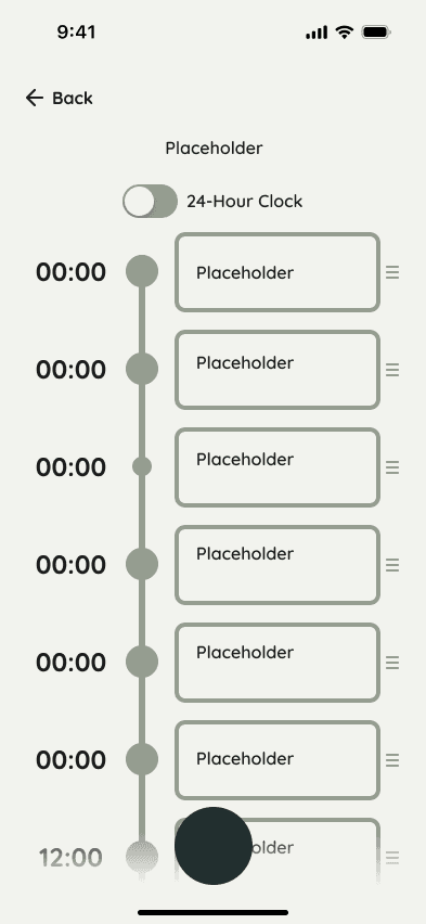
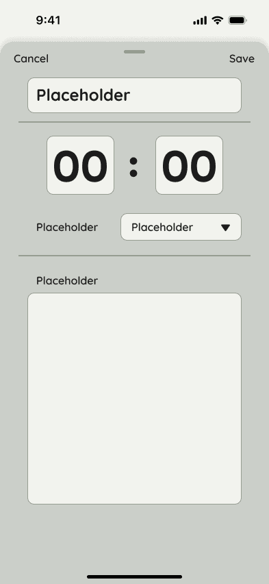
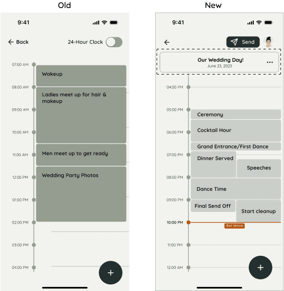
On the timeline view, there was no option for the user to edit the details of the timeline, like the name and date. So we added that information at the top so that it is clear to the user which timeline they are working on. We also added the option to quickly send the timeline and access their profile settings.
In the timeline view, we identified an absence of options for users to edit essential timeline details such as the name and date. To enhance user experience and clarity, we introduced these key details prominently at the top of the interface, ensuring users can readily identify the timeline they are working on. Additionally, we implemented a quick-share feature and streamlined access to their profile settings, further enhancing the app's functionality.
We encountered potential confusion with the circular action button in the bottom-right corner. It had been consistently associated with creating a new event. However, using the same shape and placement for a different action could disrupt user comprehension and navigation. To mitigate this, we decided to remove the button altogether. Furthermore, we relocated the 'edit' action to the top-right corner and grouped the 'delete' action within a menu for enhanced user clarity and a more intuitive experience.
Potential confusion arose regarding the circular action button positioned in the bottom-right corner of the interface. This button was originally designed to create new events. However, maintaining the same shape and location for a different action could disrupt user comprehension and navigation. As a solution, we have eliminated the button entirely and repositioned the 'edit' action to the top-right corner, while consolidating the 'delete' action within a menu for enhanced user clarity and ease of use.
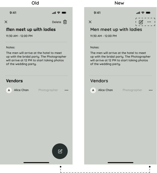
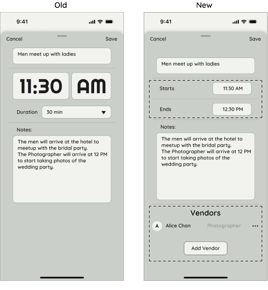
Added the ability to add any associated vendors so that the vendors would know which events are relevant to them.
Added the ability to add any associated vendors so that the vendors would know which events are relevant to them.
User feedback indicated a preference for specifying the end time rather than choosing from predefined selections in a dropdown menu. This approach aligns more closely with their familiarity and is a common method employed by scheduling applications in the market.
User feedback indicated a preference for specifying the end time rather than choosing from predefined selections in a dropdown menu. This approach aligns more closely with their familiarity and is a common method employed by scheduling applications in the market.
tests
tests
final design
final design
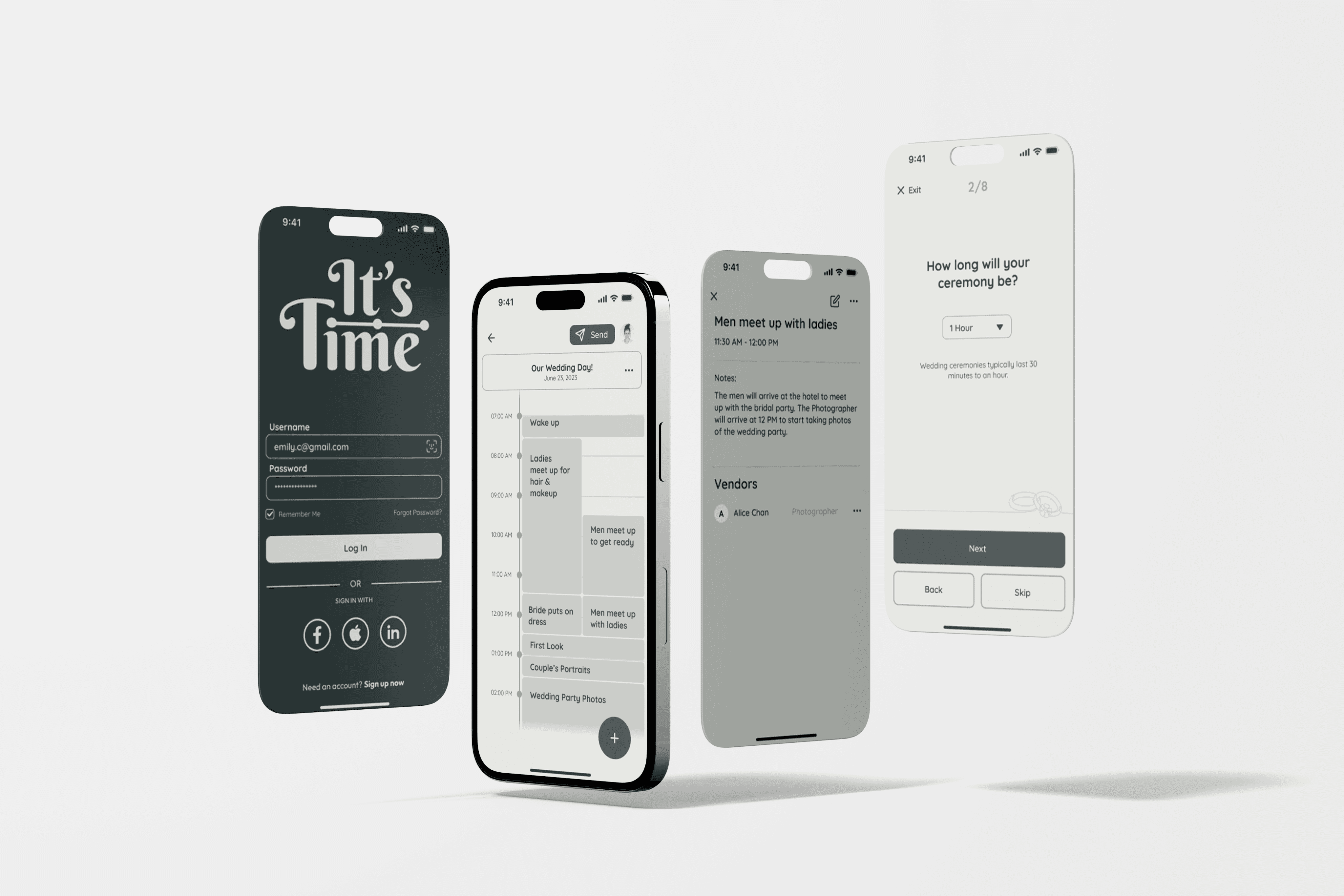
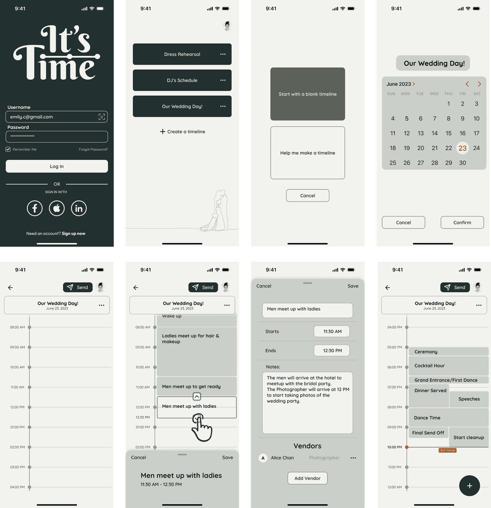
"'It's Time' is a mobile application designed to simplify the wedding planning process for couples preparing to tie the knot. Recognized as one of the most critical aspects of wedding preparations, this app has been thoughtfully crafted with features to streamline the entire process. Couples can benefit from the following features:
Flexibility to create multiple schedule variations for various events.
Intuitive drag-and-drop functionality for arranging time slots.
An interactive timeline creation wizard to guide users through the process.
Convenient sharing functionality to keep everyone in the loop.


It can be easy to lose sight of the main goal and get carried away with focusing on details that are not part of the project scope. In this project, the point was to focus on the MVP.
It can be easy to lose sight of the main goal and get carried away with focusing on details that are not part of the project scope. In this project, the point was to focus on the MVP.
It can be easy to lose sight of the main goal and get carried away with focusing on details that are not part of the project scope. In this project, the point was to focus on the MVP.
Considering known and familiar design patterns to bring ease of use. It's not always a good idea to deviate from common practices for the sake of being different.
Considering known and familiar design patterns to bring ease of use. It's not always a good idea to deviate from common practices for the sake of being different.
Considering known and familiar design patterns to bring ease of use. It's not always a good idea to deviate from common practices for the sake of being different.
Staying within scope
Being mindful of recognition
Being mindful of recognition
Being mindful of recognition
Expand upon the MVP to create a full product.
Expand upon the MVP to create a full product.
Expand upon the MVP to create a full product.
Create a website based on the app so that users can have cross platform use.
Create a website based on the app so that users can have cross platform use.
Create a website based on the app so that users can have cross platform use.
Build out the remaining features
Build a web version
takeaways
takeaways
next steps
next steps